Streamlining Workflows | HPE
Minimizing time-to-instance deployment by 15% for 4,000+ employees by optimizing an internal service broker.
AT A GLANCE
Developers @HPE create & maintain client apps by utilizing an in-house OSB (Open Service Broker) API. The OSB API aimed to streamline service delivery, but disjointed onboarding & inconsistent navigation created friction for developers maintaining agile workflows.
To address these challenges, I revamped the OSBG's developer-facing UI to streamline the onboarding product tour, improve navigation, & optimize instance management times.
IMPACT
As a UX Designer on this project, I:
Oversaw early pain point discovery
Improved priority user story tasks & metrics
Validated redesign through task completion testing
To comply with my NDA, I have redacted proprietary information. All information in this case study is my own & does not necessarily reflect the views of the company.
PLATFORM
SaaS IT Product
TIMELINE
June 2019 | Q2
3 week sprint
TEAM
Director UX Design
Head of Development
MY ROLE
UX Research
UX Design
Prototyping
User Testing
RESULTS
15% reduction
in time to instance management
200+ hrs saved
annually for multiple teams across HPE
2 user stories
supported through improved flows
THE PROBLEM
Confusing onboarding & conflicting navigation reduced developer efficiency.
HPE has shown a strong commitment to streamlining service delivery through standardized APIs across various cloud environments. However, its central OSB API posed key challenges that affected workflows across the organization.
Many in-house developers, especially new employees, expressed frustration with the OSB API, citing its inconsistency & lack of clarity as a factor delaying projects & hindering service deployment.

3 different in-house developer workflows.

My role in this redesign was guided by 3 goals:
Identify priority
pain points
Highlight central workflows affected by confusing UI
Explore
possible solutions
Consult in-house devs to study potential improvements
Optimize the
OSB API UI
Build a dev-ready prototype improving key screens
THE SOLUTION
The refreshed dashboard provides consistent navigation & clear instructions, emphasizing key actions & processes.
The OSB API was redesigned to:
Automate step-by-step navigation
Utilize clearer, more consistent labels
Centralize efficient access to key actions
Provide customizable interface organization
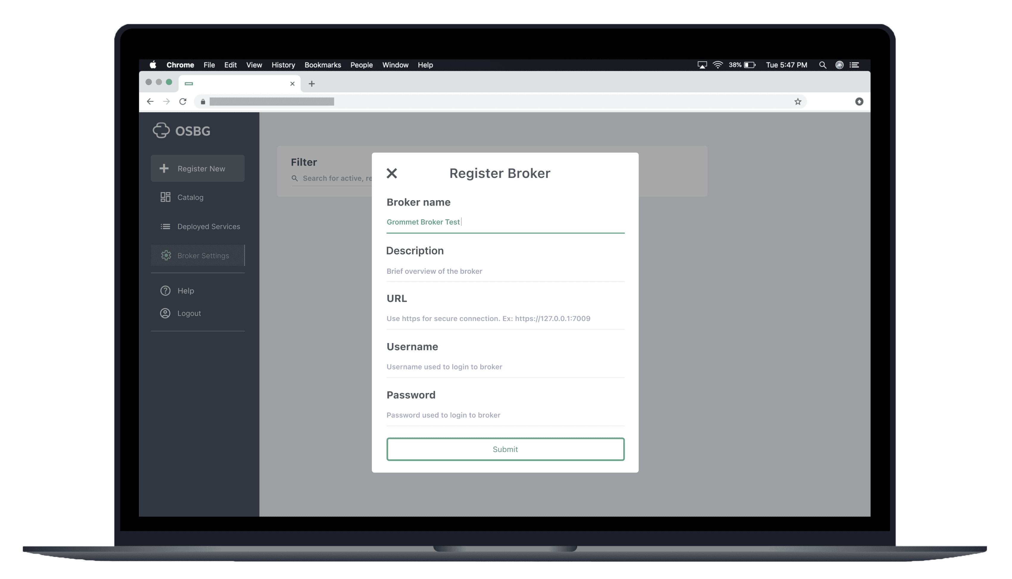
Initial broker registration screen
Layout selection & sorting methods facilitate opportunities for customization.
To support diverse developer needs, the OSB redesign introduced customizable layouts, tagging, & saved filters. These features prioritize ease of access to frequently used brokers & services, aligning the interface with individual workflows.
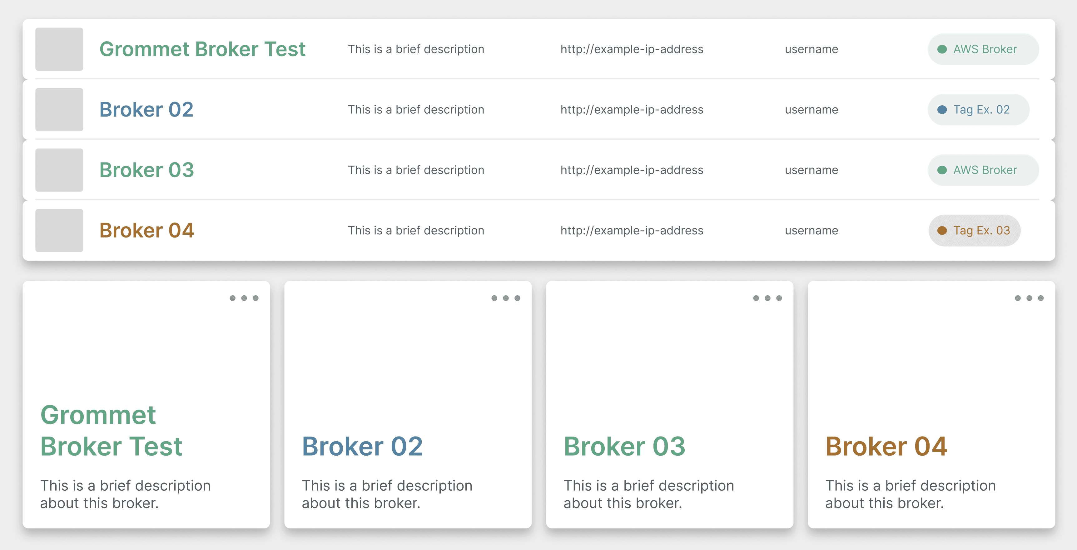
Layouts, tags, & filters allow devs to personalize their interface to optimize their workflows.
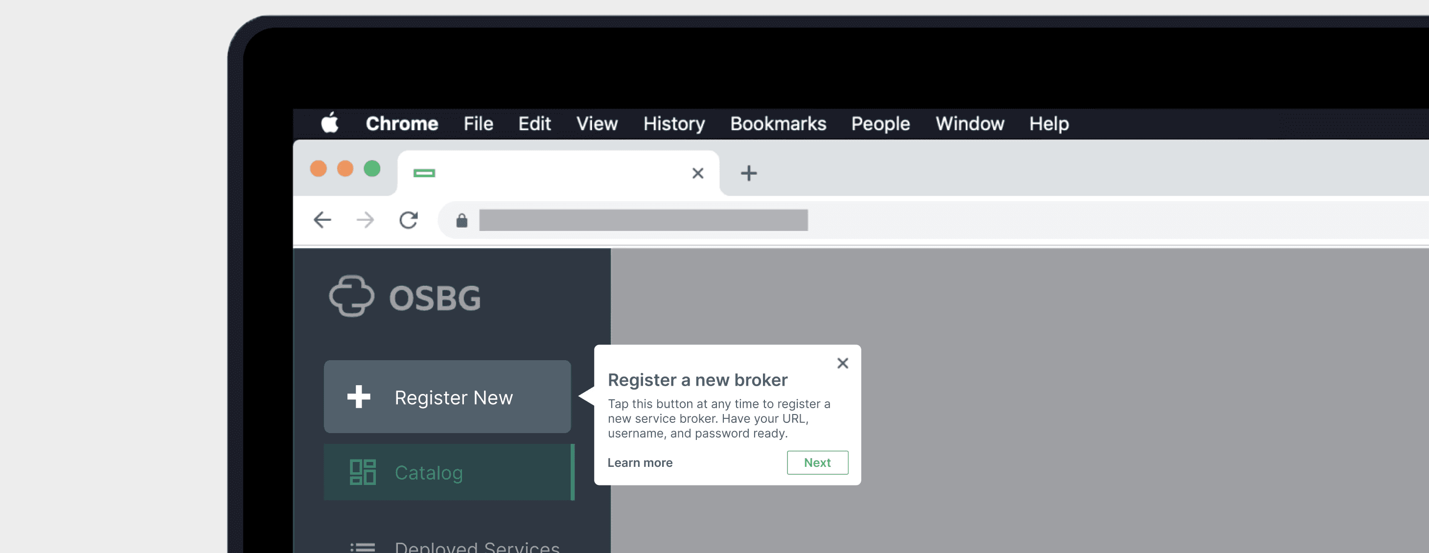
Effective onboarding gets new users up-to-speed quickly, supporting rapid onboarding & agile workflows.
Previously, the OSB displayed a paragraph of instructions at login, overwhelming & frustrating new users.
The redesigned experience replaces this with an unobtrusive product tour using brief tooltips to guide first-time users through key actions.

“If I'd initially learned on this version [of the OSB API], my job would've been much less frustrating."
– IT Engineer @HPE Dev, exploring the OSB API redesign
DISCOVERY
I interviewed 3 developers across different teams to identify how the OSB API fit into their ecosystems & how pain points affected their workflows.
I conducted 2-hour shadowing sessions on Microsoft Teams with developers to understand how the OSB API fit into their unique workflows.
All shared a common frustration: despite its centrality, the broker was often tedious to work with & took time away from other responsibilities.

Cognitive walkthrough analysis of the existing OSBG API screens, outlining key discussion points from interviews.

With these discussions in mind, I focused on building customization features for 2 central user stories:
Broker
Registration
Adding sub-brokers into the OSB API
Instance
Deployment
Launching specific broker instances
IDEATION
To prioritize features effectively, I iterated on 5 core features & conducted a $100 test on developers.
I created 30+ variations for:
High-level navigation
Personalized sorting
Onboarding & product tour
Broker registration
Instance deployment
Each UI variation was then assigned a dollar value. Developers could “spend” a total of $100 on features they found most valuable, helping us identify essential improvements & confidently deprioritize lower-impact options.
Developer feedback from task completion testing surfaced 3 core considerations:

Clarity vs Jargon: Hyper-specific language overwhelmed non-developers. Precise & approachable phrasing supported a broader user base.

Expanding Customizations: Users were excited about layout & broker organization flexibility. These ideas were flagged for deeper exploration in future iterations.

Feasibility Constraints: Some high-impact concepts exceeded our development capacity. We prioritized scaled-down versions that aligned with our timeline & resources.
DESIGN & HANDOFF
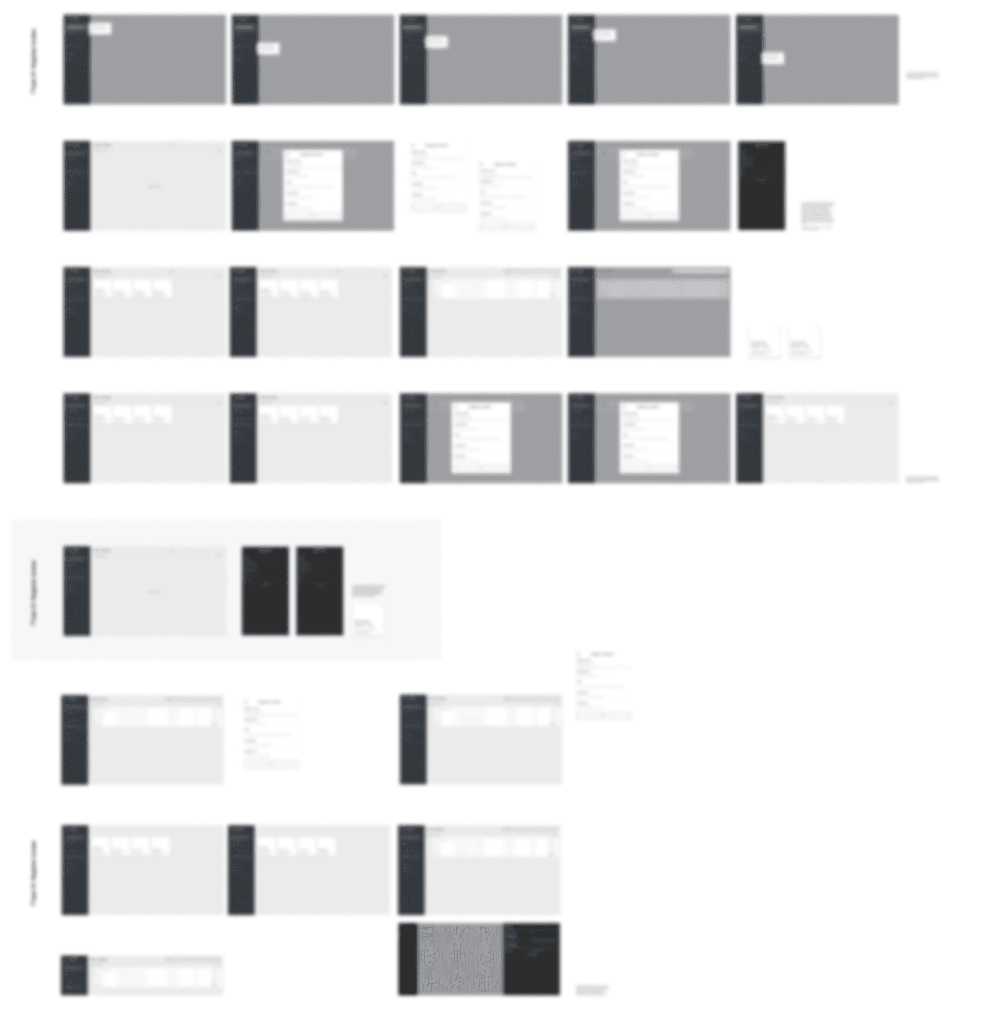
Informed by developer feedback, I refined feature priorities & developed a high-fidelity prototype with 20+ screens.
HPE did not have a standardized design system for this product, so the design system team incorporated the components I made to build a new system.
I tested my prototype with the same developers I previously shadowed. All reported faster task completion, & highlighted the customizable sorting & layout features as major improvements.

High-fidelity screens & assets outlining initial onboarding & broker registration.
The updated OSB UI was launched in late August 2019 & was well-recieved by devs across HPE.
My final prototype directly informed the official redesign, which provided quick quality-of-life adjustments that supported agile developer workflows.
A step-by-step tutorial was shared alongside the updated UI, providing a quick way for devs to relearn & effectively incorporate the OSB API into their projects.

Read HPE Dev's blog post on the OSB API

RESULTS
Redesigning the OSB API wasn’t just about improving a tool – it was about empowering developers to work smarter & faster.
By addressing key usability gaps, the redesigned experience had the potential to save HPE teams 1,000+ hours annually. Even with a limited rollout, implemented features dramatically enhanced clarity, reduced time-to-task, & supported efficient cross-departmental workflows.
For me, this project was more than a successful redesign: it marked the beginning of my journey into UX & product development. I’m grateful to HPE for the opportunity to grow one of their central systems.
MY TAKEAWAYS
Embrace the unknown
It’s ok to not know something – challenge yourself & learn!
Leverage
limitations
Working with existing systems can make solutions stronger
Small changes,
big results
Thoughtful decisions can help those beyond core users
Manager Feedback
Alex Mejas
Head of Development
During my career, I've worked with many young professionals; Laiba is one individual who uniquely stands out amongst the rest.
For the past year, I've had the pleasure of working with Laiba in HPE's Chief Design Office Ul/UX team. She assisted our HPE Developer program in creating its new mascot & provided exceptional Ul/UX designs for our summer project.
While Laiba has incredible creative & technical skills, she is also a pleasure to work with. During the months HPE underwent restructuring, she displayed an excellent self-starter attitude by picking up projects with little direction.
Other Projects

Currently
Completing my BFA in UX Design @UNT while doing freelance & contract work. Advocating for the value of design thinking. Always down to chat (reach out anytime!)